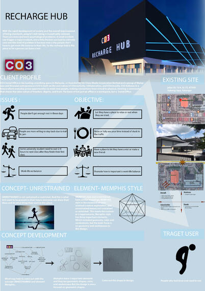
The recharge hub is the place to supply a place to let people rest or relax because, With the
rapid development of society and the overall improvement of living standards, people's well-
being is inexplicably reduced. There are more and more psychological problems. A small
incident can trigger a major incident, and a little friction can lead to a bloody case and this
kind of problem is because now a day people don’t have to get work-life balance in their life.
So the recharge hub is the place to let people can have a rest when they are tired.
CO3 objective is CO3 is built on the core values of COnnectivity, COllaboration, and
COmmunity. CO3 believes in a future where everyday poses opportunities to meet new
people, making connections from virtual to physical, forming a community that shares the
same values of freedom, dignity, and trust. And this helps me to come out with the concept
UNRESTRAINED is not restrained or restricted. And this is what CO3 want to be present in
their future everyone can share their ideas and do what thing they want in this place. And
the unrestrained come out with the concept element is Memphis style. Memphis style has 3
important elements are color, geometry, and stochastic, I just focus more on geometry.
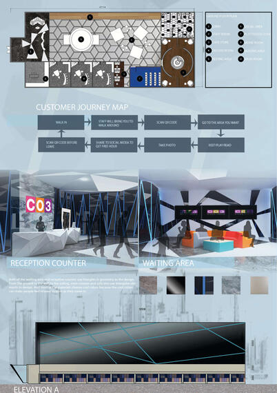
first, when are into the entrance, we can see Both of the waiting area and information
counter use triangles in the geometry as the design. From the ground to the wall to the
ceiling, even counter and sofa also use triangular elements to design. And most of the
materials choose cool colors because the cool colors can make people feel relaxed as soon
as they come in and tend to stay longer.
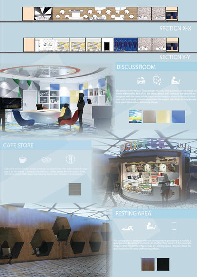
Second, the resting area is designed with the honeycomb in geometry. It is mainly a good
place to be alone. Customers can do what they want in it. For example, they can use the
material because of the solitary space. The wooden material. Because wood has good
resistance to noise and relaxing effect.
Third, The design of the Discuss room adopts the color and geometry of the major elements
of memphis3. First of all, the table; carpet, and ceiling on the ground are designed with the
same shield shape and rectangular shape. In terms of color, cool colors are used as much as
possible. The aspect of color helps to help people have good ideas when discussing things.
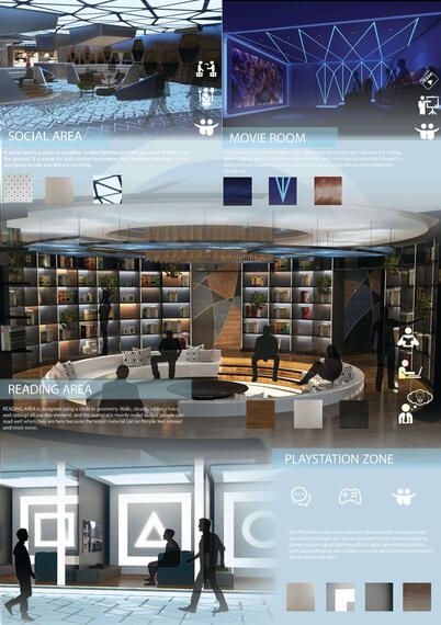
Next, The social area you can see has a lot of geometry at a place like a honeycomb,
triangles, square, and circle in the area. A social area is a social place, so dim lighting and
tiles are used to reflect on the ground. It is easier for both parties to increase their feelings
and to go to the dim place to talk and discuss mentally.
The Playstation area is designed on the wall with the representative circular triangle and
square geometry of ps. Because playing games requires good lighting effects, lights are
installed on the walls and ceilings to allow players to have good playing experience and
protect their eyes.
READING AREA is designed using a circle in geometry. Walls, closets, tables, chairs, and
ceilings all use this element, and the material is mainly wood so that people can read well
when they are here because the wood material can let People feel relaxed and resist noise.
The movie room uses triangles in the geometry to connect the wall and the ceiling, and led
lights are also installed in the middle, and the material selection is biased to dark colors
because it is not necessary to focus on other places when watching movies on.
© 2020 by INTI Center of Art & Design. Proudly created by the ICAD Voyage Showcase Committee.


